Concept
The initial idea for Nesture was born out of a lack of quality raw eggs available in the United States. Nesture was designed for a growing market of egg producers and consumers who value freshness, transparency, and small batch sourcing over mass distribution.
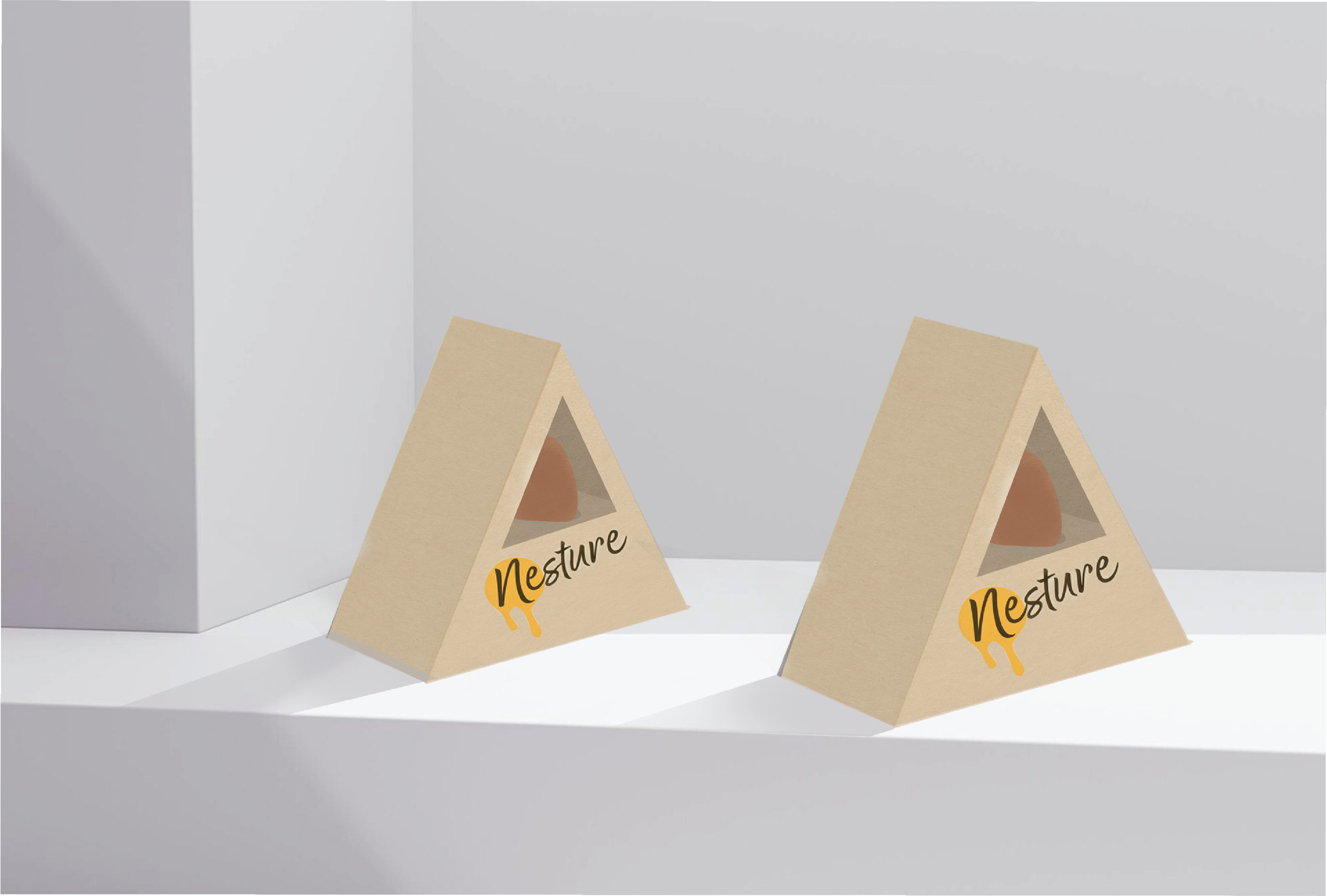
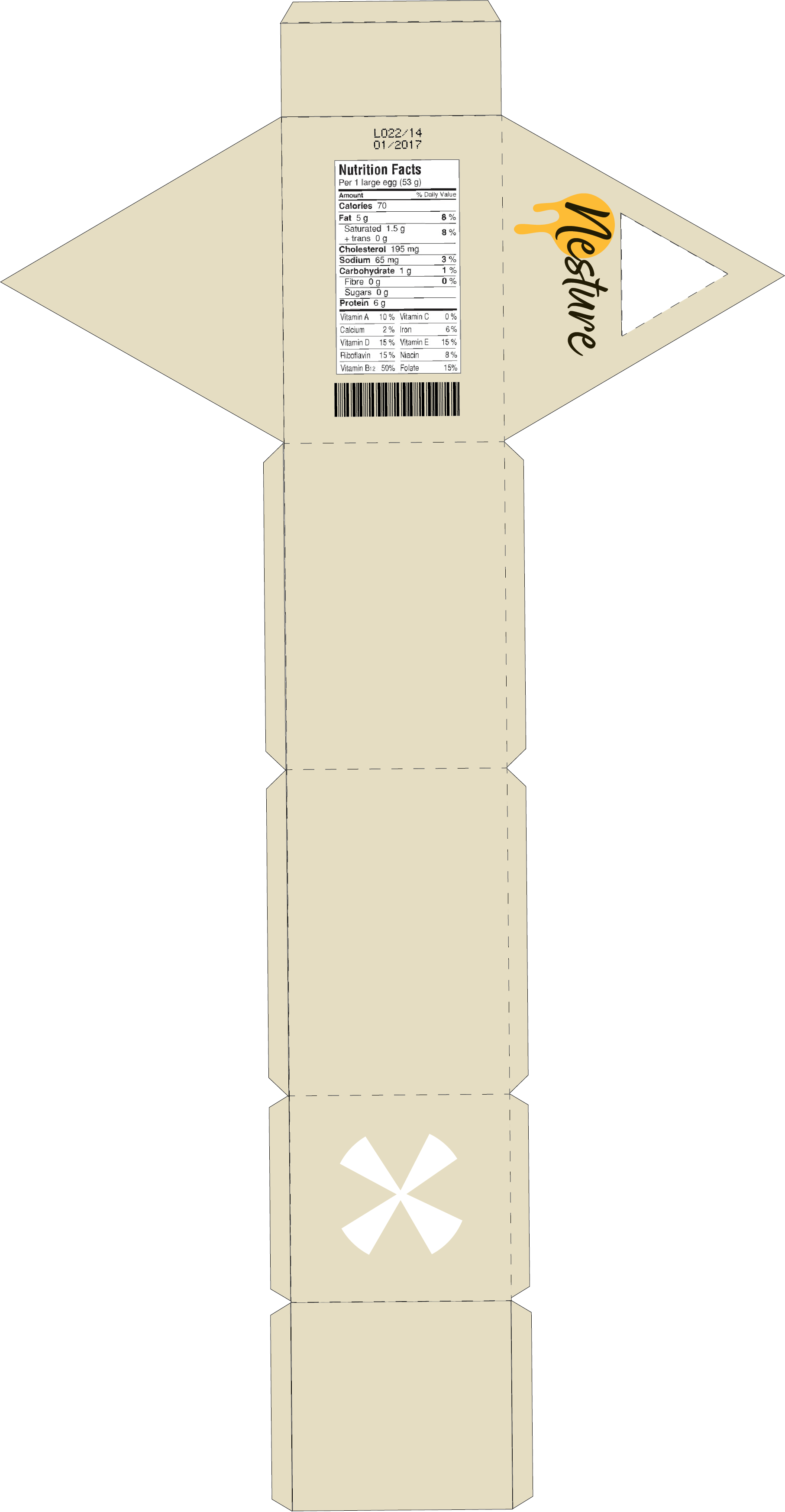
Unlike traditional multi-egg cartons designed for scale, Nesture offers a single-egg solution that highlights quality and local origin. Its distinctive triangular form cradles one high-grade egg securely, evoking both natural shelter and sculptural display. Made from recyclable materials and designed for reuse or composting. Nesture reflects the values of small-scale, quality egg producers, emphasizing freshness, sustainability, and offering consumers a singular product worthy of distinction.
Description
Nesture reimagines egg packaging for a new generation of conscious consumers and independent producers. Designed for farmers market vendors and small-scale egg sellers, Nesture elevates the experience of buying and selling premium, pasture-raised eggs that can be savored raw. Its sculptural, triangular form cradles a single egg with care, emphasizing freshness, local origin, and artisanal quality.
Made from recyclable and compostable materials, Nesture champions sustainability at every step, supporting a sustainable supply chain while helping producers showcase their eggs as thoughtfully as they were raised.
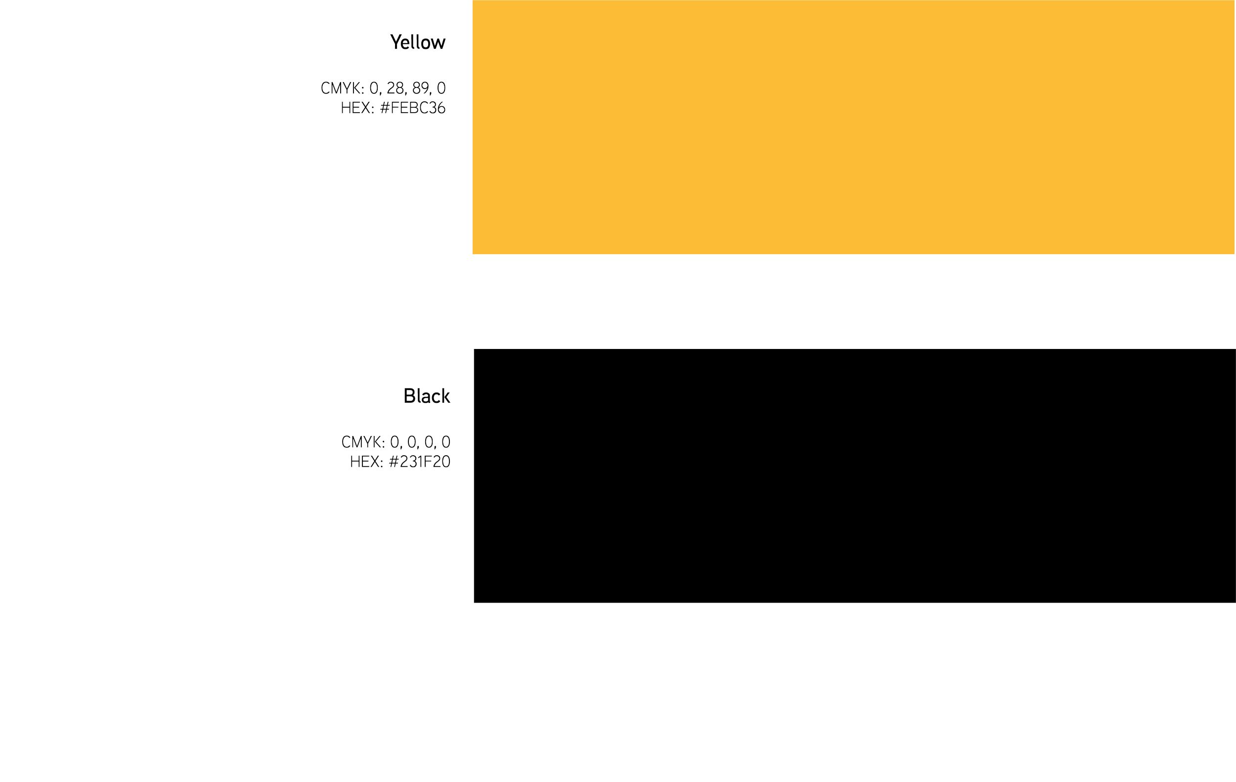
Nesture’s color palette combines bold black with a warm, natural yellow. Black grounds the brand with simplicity and clarity, while the yellow, echoing the color of a fresh yolk, adds energy, freshness, and visual recognition. This pairing reflects Nesture’s commitment to clean design, raw egg safety, and local sourcing. The contrast is eye-catching yet minimal, helping Nesture stand out while staying true to its humble roots.

The Nesture logo features a handwritten wordmark set in the Good Karma Smooth typeface, chosen for its warm, approachable style that reflects the brand’s homegrown roots and focus on simple, honest design. The rounded, casual letterforms suggest care and familiarity without feeling overly stylized, aligning with Nesture’s mission to make high-quality eggs feel both accessible and trustworthy.
Wrapping around the capital 'N' is a golden yellow dripping yolk icon, a nod to the eggs freshness and the product's single-egg purpose. The logo works well across scales and surfaces, maintaining its clarity on recycled cartons, farmer’s market stands, or digital platforms. Together, the hand-drawn text and yolk motif create an identity that speaks to Nesture’s values: local sourcing, transparency, and high quality.

Nesture’s visual identity features Aaux Next, a contemporary sans-serif typeface selected for its clean, modern appearance and exceptional legibility. The typeface is versatile, designed to work across a range of applications, from the fine print on our packaging to larger marketing materials.
Its minimal design complements the brand’s simplicity and natural aesthetic, ensuring consistency alongside Nesture’s bold black and yellow color palette. Whether on digital platforms or printed materials, Aaux Next enhances the clarity and approachable, yet sophisticated, nature of the Nesture brand.